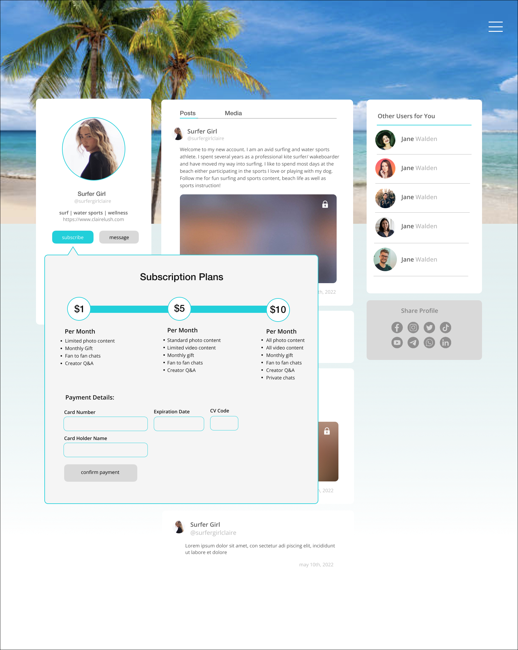
User profile + Content commerce exploration (2022)
This is a redesign of the Only Fans user profile page. They have one of the most notoriously poor user systems, and these are two versions of how a user could purchase content from a creator. To the profile page I added clear messaging and subscription buttons, suggested users, and ability to share the profile directly. The suggested users will increase traffic to the website and allow for users to explore more profiles to subscribe to. The subscription button opens a box within the page that allows users to choose a subscription plan on a sliding scale that then takes them to the product purchase page. The purchase page gives users an easy and simple way to subscribe.
Regarding the design of the first website, I wanted to keep it clean and simple with the dark background while adding some intrigue with the bright accents. The colorful gradients, thin rules, and sans serif type add to the overall creative yet professional feel.
For my second attempt at the design challenge, I took a more minimalist design approach. I changed the dark background to a subtle blue and gray gradient. I was inspired by the structure of other social media platforms such as Instagram and Twitter. The white boxes add separation and organization to the site. I kept it simple with white, various shades of gray, and an accent of teal. In terms of functionality, I made a few changes. For the subscription pop down menu, I decided to expand upon it for e-commerce, rather than having a separate purchase page.